How to Optimize Your Main Amazon Product Image for Better CTR
Your product’s main image on Amazon is often the first (and maybe only) chance to grab a shopper’s attention. A study from MIT discovered the brain can process images in as quickly as 13 milliseconds! So that first photo needs to immediately stand out.
A compelling main image can dramatically boost click-through rates (CTR) and even improve your organic search ranking over time. After all, Amazon’s algorithm rewards listings that attract and convert shoppers (this is part of the larger process known as the Amazon flywheel).
In this article, we’ll explore best practices and strategies to optimize your main product image on Amazon.
Related reading: Amazon images & photography


Why is the main product image on Amazon important?
When a customer starts a search on Amazon, they type in a generic search term and look through the results.
The image is the first visual touchpoint you have with a potential customer. If done well and optimized, it can attract customers to click through to your listing. The more clicks and conversions, the better your product will rank, appearing higher on the search results page. That is the goal!
If done poorly, your product won’t appear very high up, or worse, if you’re advertising on a main image that’s not optimized, you’re wasting your money. People will simply glance over it without giving it another thought.
The main image needs to signal to the customer, “Hey! This is what you’re looking for. Click me to learn more”.
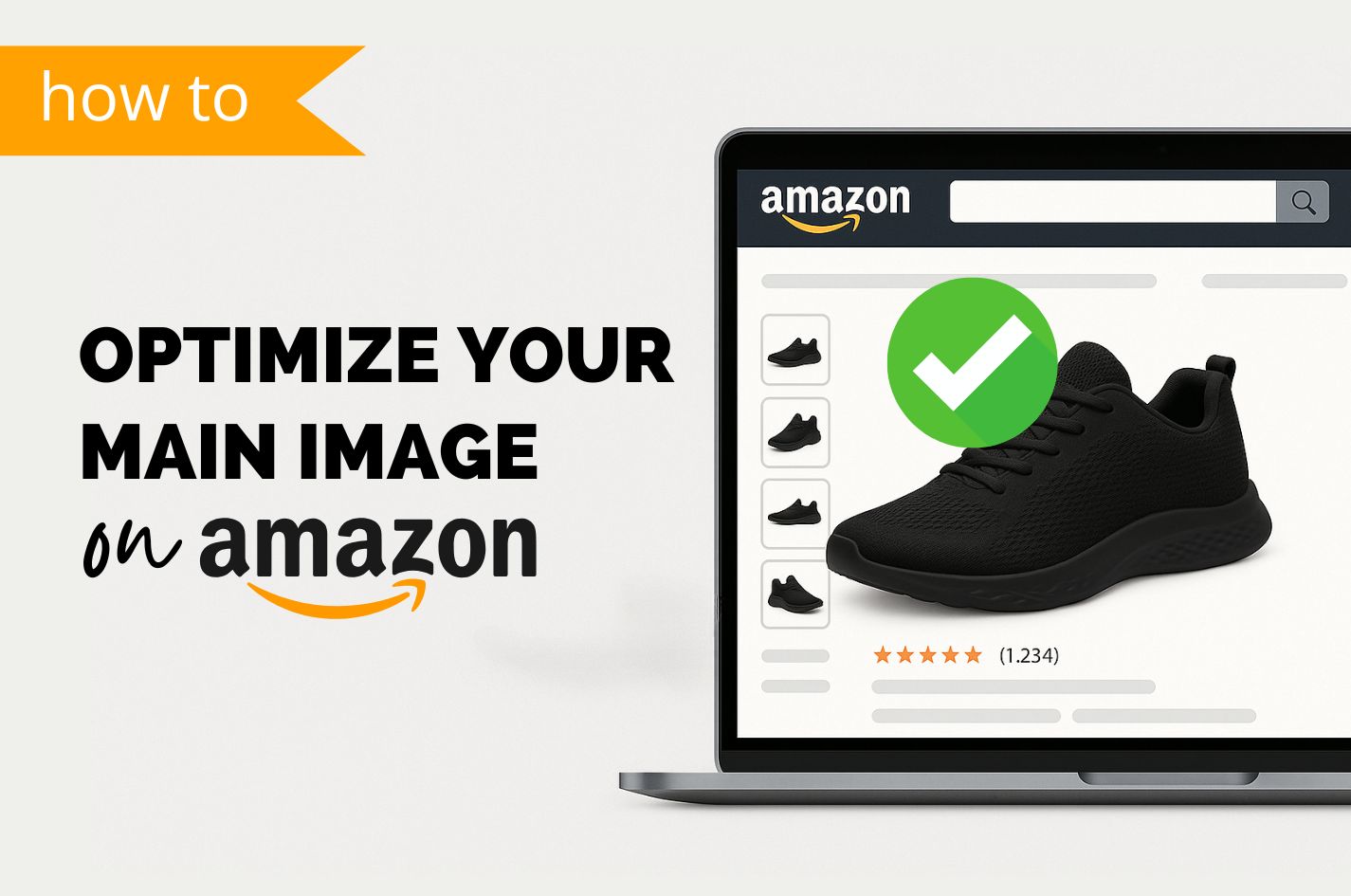
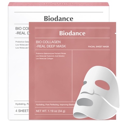
✅ Example of a good main product image
- Clear, high-quality photography
- Easy-to-read text with important keywords tells what the product is
- Shows the product outside of the package
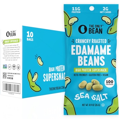
❌ Example of a not-so-good main product image
- Unclear photo – not sure what the product is
- Text is small and difficult to read
- Gets lost among other main product images
Amazon’s main product image requirements and must-haves
Before getting creative, ensure you know how to make your main image meet Amazon’s guidelines. Amazon can suppress or demote listings that violate image rules, so think of these as non-negotiable checklist items:
- Pure white background: The main image must have a pure white background (RGB 255,255,255) so it blends with Amazon’s search results. No off-white, no colored backgrounds – just clean white. This keeps focus on the product.
- Show the entire product: The image should display the full product that’s for sale, outside of any packaging. Don’t cut off parts of the item; the product shouldn’t be cropped by the image frame.
- No extra props or text: Amazon prohibits added text, graphics, watermarks, or promo badges on main images. The image should be a professional photo of the product itself, not an infographic or advertisement. Set proper expectations and don’t show accessories that aren’t included – this can upset the customer.
- High resolution & quality: Ensure the photo is high-resolution – at least 1000px on the longest side (Amazon’s minimum for zoom). We usually design at 2,000px so shoppers can look closely at details if they choose. The image should be sharp, well-lit, and not pixelated or blurry. Use good lighting and focus so that your product looks crisp and true-to-life.
- Proper framing and sizing: Amazon suggests the product should fill around 85% of the image. This means no tiny product in a big white square – zoom in (or crop) so that your item takes up most of the space, while leaving a bit of white border. This also maximizes visibility on the search results page. Stick to a square aspect ratio (Amazon uses square thumbnails). Standard practice is a 1:1 ratio (for example, 2000 x 2000 pixels) so use all available space.
- File format: Use JPEG (JPG) format for best results (Amazon also accepts PNG, TIFF, GIF). Color mode should be sRGB. Avoid huge file sizes as Amazon caps at 10,000px on the longest side, and won’t accept files larger than 10MB.
- Follow category rules: Some products have category-specific exceptions. For example, adult clothing can use a live model, but kids’ and baby clothing cannot show the item on a model. Jewelry can be slightly cropped. Check Amazon’s category-specific image guidelines if applicable. When in doubt, a safe approach is the product on white, no distractions.
Understanding the Amazon search results page (SERP)
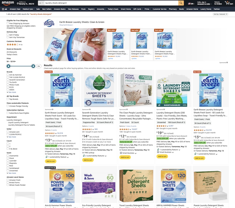
Let’s look at the search results page for “healthy dog treats” and put ourselves in the shoes of the customer (not hard if you’ve ever bought anything on Amazon).
As you can see below it’s pretty busy with a lot of items competing for the customers attention.
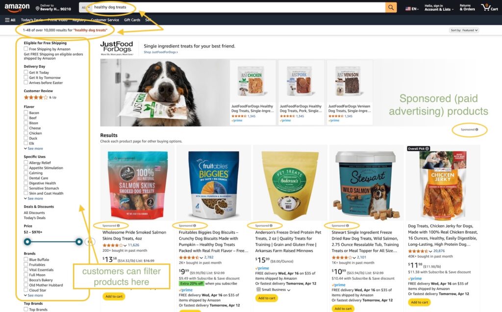
You can already see there are over 10,000 results… this first page shows the first 48 plus ads.
At the top of the page is a Sponsored brand ad – recognizable by the main image with 3 products next to it.
On the next line are the “Results”. You’ll notice that (or not, since it’s not very visible) the first 4 of the 5 products are “sponsored” or ads. The 5th product is truly the first organic result.
Customers can also use the left-hand side bar and filter out their preferences depending on specific uses, flavors, brands, weight, reviews and more (just one of the reasons why filling in as much of the product details when creating a new product is beneficial).
Now that a customer is given all these options, they start comparing the products. Maybe they’re already comparing prices, searching for what’s the most economical (they might glance quickly at the title too).
You can see why having a solid main image is important in getting the customer to click through to your listing. So how do you do it?
How to stand out on the SERP
The best place to start is on the SERP page itself. Check what your competitors are doing and if you can do anything different. Here are some results for “organic coconut oil”. It looks like each listing has opted for a little bit of a different route:
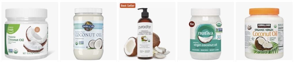
Try to notice which ones your eye automatically goes to and if you can pick up any patterns. You can see that different colors stand out differently against the white background and some are easier to read then others. The Best Seller badge also makes a big difference (learn more about Amazon Badges here)
Here are our top tips for optimizing your main product image.
Make it big
Like we mentioned above in Amazon’s image guidelines, we recommended using clear, high-quality image photography. Using at least 2,000×2,000 pixels ensures the quality is high on the SERP and allows for zoom functionality once the customer clicks through, improving user experience.
Try to get the packaging or product shot to take up as much frame space as possible. Below is an example of stretching the product to make it larger.
This also makes it easier for the customer to read the label:
✅ Takes up max space (text is quite small and hard to read, though)
❌ Too much “white space” around (background not even white)
❌ Not using 1:1 (square) ratio makes the image even smaller
Leverage packaging and labels to communicate key info
If your product comes in attractive packaging or has labels or certifications that communicate important features, show them off in the main image. A branded box or tag can be used in addition to the product to quickly convey size, flavor or other benefits that a customer may be searching for.
Just make sure the packaging doesn’t block the product itself.
Make the label/packaging easy to read
This is an important one. When people are scanning through products, they’re unconsciously looking for their search phrase or something similar.
Make sure your product has what it is in big enough letters to be seen in the tiny thumbnail on the search results page.
✅ Easy to read product packaging:
❌ Difficult to read product packaging:
❌ Package text very small and hard to read
❌ White text on red background is hard to read, also quite small
❌ Text is hard to read, strange shadow covering left side of packaging
Some brands with higher recognition may not need to follow the rules – a customer may be able to spot what they’re looking for just by the packaging. For a new seller, this is something to consider.
Leverage keyword research
So how do you decide what to include on your main image packaging?
This is where keyword research comes in handy. Knowing what customers are searching for will help you identify these opportunities. Then you can make the most important ones legible.
Some examples of specific, use-case, long-tail keywords: treats for small dogs, rosemary oil for hair growth, baby bottles for infants 6-12 months.
It may seem counterproductive to be specific, but by narrowing your target audience, you increase the chance of attracting the right shopper.
Related reading:
Amazon Keyword Research with Helium 10 for SEO Listing Optimization
Discover how Helium 10 simplifies Amazon keyword research and listing optimization for higher visibility, conversions, and sales.
Highlight crucial specs on the label
Think about what one or two key facts a shopper might want to know at a glance. Think about what one or two key facts a shopper might want to know at a glance. Is it 25g protein per serving? Sugar-free? 100% organic? If your product’s packaging or label can display that, it can be a game-changer for CTR.
Consider:
- Size & serving
- Use case examples (like the ones mentioned above)
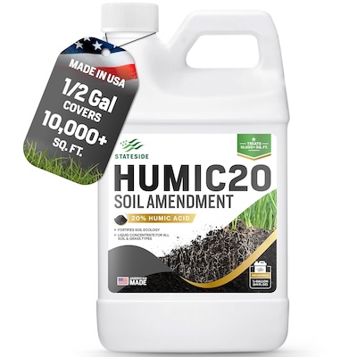
- Certifications: If your product is USDA certified organic (or has any other important certification) call it out! Include the logo on the packaging if possible so a customer can see it right from the search results page.
- Ingredients: present or not (examples: gluten-free, keto, diabetic-friendly)
Including these words or phrases is like adding a big waving flag calling to your customer.
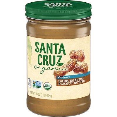
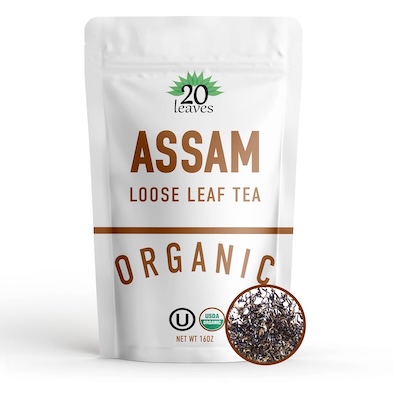
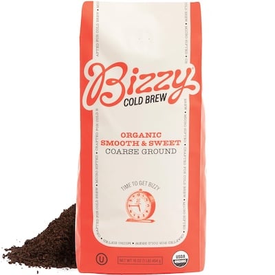
✅ Mentions organic (but in hard-to-read cursive font). Includes USDA Organic and Non-GMO logos
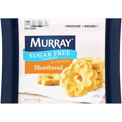
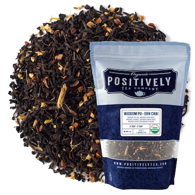
✅ “Sugar free” stands out
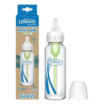
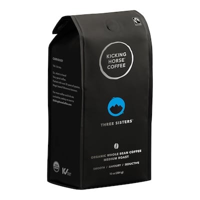
✅ Keywords “anti-colic” and “glass” stand out
Include packaging or what’s included
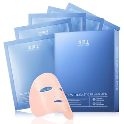
Packaging makes up part of the customer experience (think unboxing videos) and can give the idea of increased value. A premium gift box can signal value or high quality and offers an extra canvas to add details.
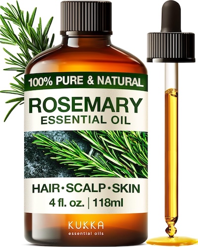
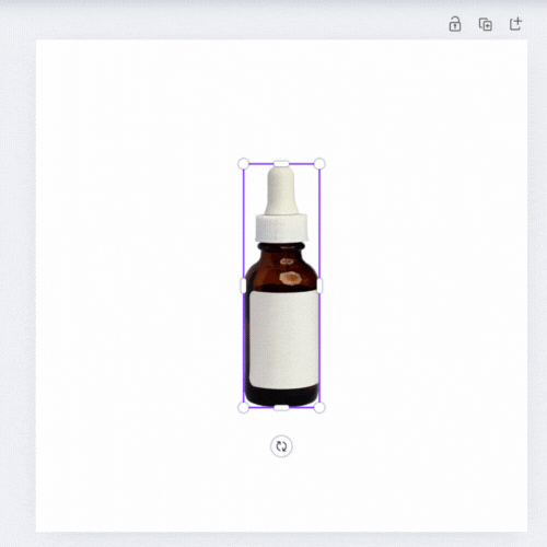
✅ Picture of dropper helps customer better understand how to apply the product
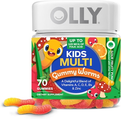
✅ Includes free gift shown in the main image, shows the packaging
✅ This packaging adds a high-end, luxurious feel to the product
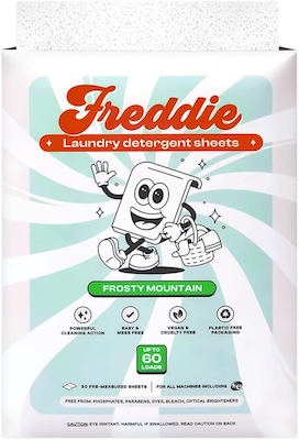
Use color to stand out
We mentioned this earlier, but if you’re able to zig when everyone else is zagging, a different color or packaging can help automatically draw a customer’s eye to the product that stands out from the rest.
Even though the main image highlighted below isn’t the best (the product shot has some glare that makes it hard to see, while the white text on the turquoise background is hard to read), it still stands out.

Show some of the product outside the packaging
This gives the customer another visual cue about what they can expect as well as the size of what they’re getting. It adds a little depth and can help it stand out in search.
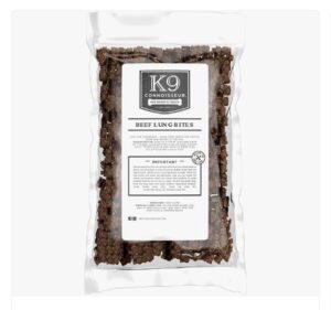
Can be applied to spices, treats, candies, vitamins etc.
A/B test your main image
A little tweak can go a long way. Amazon’s brand-registered sellers can A/B with Manage Your Experiments.
If your ASIN has enough traffic, you’ll be able to upload a version A and version B of your main image. Amazon instantly splits the traffic in two, showing each image to shoppers, tracking impressions, clicks and sales. Once enough time passes, Amazon determines a winner that you can publish with just a click.
Testing with real data is one of the best things you can do to increase click-throughs on your image.
Key takeaways
- Your hero image is your click magnet. Shoppers can process a picture in as little as 13 ms – faster than a blink – so that thumbnail must scream “click me” at first glance.
- CTR → sales → rank. Amazon’s A10 algorithm rewards listings that win more clicks and conversions, so a stronger main image can lift both sales velocity and organic position in the SERP.
- Stay 100 % compliant. Pure-white background, product fills ~85 % of the frame, no extra text/graphics, 2,000 px + resolution. Break a rule and Amazon can suppress your listing overnight.
- Show value instantly. Use packaging, labels, quantity shots, or an in-use model (where allowed) to answer the buyer’s top question without extra words.
- Differentiate at thumbnail size. Scan the live SERP, then zig where rivals zag: contrasting color, 3-D angle, all pieces visible, or a lifestyle cue that none of the page-one competitors show.
- Test, don’t guess. Brand-registered sellers can split-test main images with Manage Your Experiments inside Seller Central; even a small change can double CTR.
- Iterate continuously. Re-shoot or re-render seasonally and whenever competitors raise the bar. Small, data-driven tweaks compound into big revenue gains over time.

Struggling to do it all alone?
Amazon listing optimization
Get your product in front of the right customers with targeted keywords, engaging visuals, and persuasive listing copy.