Amazon Storefront Examples: 7 Brands Crushing it in Grocery
There is certainly no shortage of great Amazon Storefront examples out there in the world but it can be difficult to find them just by searching around on Amazon.
So I’ve compiled a few here – specifically from food companies – to help you see what some of the market leaders are doing to help you get ideas for your own storefront.
Hope it helps 🙂
Table of contents
What are Amazon Stores?
First, if you’re not aware, Amazon Stores (formerly called storefronts) are a “new” way for brands to showcase themselves on Amazon. Ok not new but they’re really starting to gain traction after being launched in 2018. If you want to dive into more detail about Amazon Storefronts, don’t miss our Ultimate Guide.
Available for Brand Registered sellers, Amazon Storefronts are being pushed more and more by Amazon as they look to give brands more tools to sell and grow on the marketplace.
Built in the backend, you can utilize video, images and links to your product pages to show off your brand and what you have available for sale.
Why Should You Have One?
Having an Amazon store is starting to provide some real benefits as Amazon has recently changed the brand URL on the product listings to make it clear when a brand has a storefront.
You can get access to additional metrics in the backend to see how it’s performing, and you get a link to a page that you can direct off-Amazon shoppers to as well.
This allows you to drive sales and awareness throughout your entire catalog from one place while protecting the traffic you send from being dragged away to competitors on the search results page.
Amazon Storefront Example 1: Pirq is Simply Creative
Pirq sells protein shakes and what you can tell right off the bat is that their products are Non-GMO, Vegan, Keto and Kosher: all important aspects of food products these days and big trends of the green marketing sphere. By putting these details in the callout at the top they’re making sure their customers know they meet these needs.
The design starts out simple and makes use of a video upfront to show their founder, reinforce their product values and make their brand more personable. After the video they follow up with some products – making it easy in case you came to buy.
It’s what comes next that really blows me away. They make great use of the half-page large image modules to beautifully display their products and ingredients while including CTAs to bring you to their product pages which they’ve divided up into flavors.
I love how these images flow into each other, alternate value statements with easily readable text and include “fake” CTA buttons so you know you can click through to the product page.
Pirq do a great job of showing off their products on the product pages. They turn the whole page into another sales page. I’ve included an image below the main storefront image so you can see it.


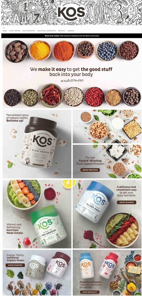
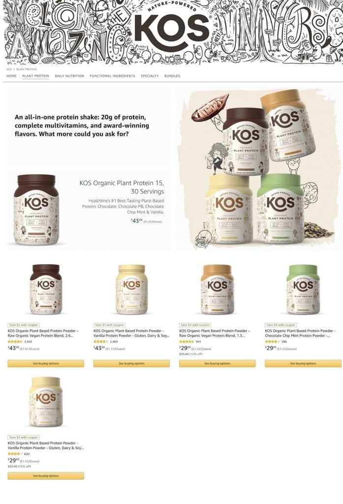
Amazon Storefront Example 2: Colorful Kos
Kos really lets their personality shine with their storefront. They’re a plant-based supplements brand and their banner image does a great job of showing their logo, what they’re about and keeping it a little weird.
They follow that up with two incredible sections.
The first, if you don’t see it, is a statement on Black Lives Matter. Kos states that they stand in solidarity with the black community. Now, I don’t know anything about their commitments or promises but this is a great example of using your storefront to communicate social justice values and make an important statement to show the world what you value.
The next part shows off more of their personality. They display both what they’re about and surround it with beautiful colors, giving off a sense of playfulness that is consistent with their brand.
It really feels like this brand has some personality behind it. Like there are people who make this product.
So why are these 3 sections so important?
They create trust.
This is what branding is all about and Kos absolutely crushes it.
After that it’s beautiful image after beautiful image, all custom and colorful. Utilizing internal links to bring them to the product pages where they do an incredible job showing off their brand’s personality again and displaying their products right below it (images below).
Amazon Storefront Example 3: Terrasoul Foods is Catalog Focused
Fellow 1% for the Planet member Terrasoul Foods, a seller of organic superfoods, has a sizeable catalog and so has taken the opportunity to show off that whole catalog with their store. They keep their home page simple and organized.
For the top banner they go with a more emotional connection, displaying their simple but beautiful packaging with a good mix of colors. This is a great example of a simple design ethos showing who they are and what they sell.
I would assume here that their objective is quite simple: display their catalog and generate sales from the traffic directed to the storefront. Anyone who is visiting their product pages and clicks through to their storefront will also get a quick feel for their values with the trust badges. Many of these badges would qualify for Amazon’s fairly new Climate Pledge Friendly badge. I wonder if they’ve jumped on that opportunity yet.


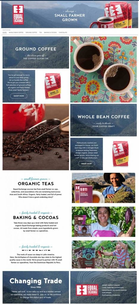
Amazon Storefront Example 4: Value Oriented with Equal Exchange
Equal Exchange really knows their customer.
We talked about this in our A+ content examples for food companies but here they’ve done it again.
You can see from their top banner that they are speaking directly to their customers’ values and showing that they are aligned.
They break into benefit sections with great copy and beautiful imagery while continuing to reinforce their values. All of this done with the continued use of the color scheme we saw on their A+ pages which keeps everything on point.
They do a great job of utilizing internal storefront links on their home page to make it easy for the customer when they find something they like. And they don’t skimp on the product pages either.
They use more branded imagery as they go through with consistent design showing off their product with links to the product pages below.
The storefront here serves as a great example for customer discovery. At least for me personally. I had no idea they made cookies and chocolate. Now I do and I’ll be keeping an eye out for them in stores as well.

Amazon Storefront Example 5: Death Wish Coffee Makes a Clear Statement
I’ll be honest. I’m not a fan of their home page but they’ve got enough right in some other spots to warrant showing here.
For one, their banner image shows what they’re all about. World’s strongest coffee. That’s what made them and it’s what their brand is built on which makes it a key statement here.
While their home page may not be great their cold brew product page is something to admire. They’ve taken a whole page and dedicated it to promoting one product, making their statement clear again on the top and creating some great infographics to sell it.


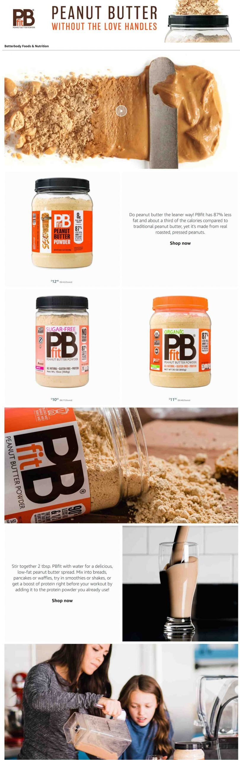
Amazon Storefront Example 6: PBfit Looks good on mobile
PBfit, makers of peanut butter powder, have done a nice job of optimizing for mobile. While this might mean the desktop version isn’t as flashy and the images are a little simpler they’ve got the main points correct.
The banner image speaks directly to why people purchase the powdered version.
They’ve got a great video full of delicious shots and it demonstrates how it’s made in case you were wondering.
It’s also a nice one-pager, meaning the only links available go directly to the product page for them to buy.
I guess we really appreciate PBFit’s effort because we also talk about the use of keywords on their product listings. They’ve got the whole Amazon package!
Final Amazon Storefront Example: Hu Can do it too
This last one is included because it just has great balance and is easily replicable.
Hu makes “Food for Humans” and gets this across in their banner, speaking directly to their customers’ values.
They use the space on the home page to talk about what they do and the types of products they make.
Nothing too fancy, just text images and some basic photos in the hands of a good designer.
Links are broken into 4 sections at the bottom so the customer can find what they want without clicking the dropdown.
Speaking of product pages. I’ve included the image below of how they’re using their store to promote their new “baking for humans” line. Great addition although I probably would have called it out more in the storefront to raise awareness. 😊


Bonus Branded Store Example: Banyan Botanicals Prepares for the Season
I’m a big fan of seasonal promotions and marketing. Banyan thought ahead, knowing their customers and products well enough to present “Winter Wellness Essentials” on their landing page. This would have also been a great place to include a shoppable image since each of these products is available on their Amazon store.
Banyan has organized its navigation bar and pages to make it easy for customers to find what they want.
And if they’re new to Ayurveda and not sure what they’re looking for, there’s a video to explain what you might be and the following sections that introduce the most popular products.
This company has been around for a long time – 25 years – so they want to celebrate it. Their “About Us” page shares their brand story and does a great job of showing their commitment to social and environmental responsibility with their badges and B Corp certification.


Storefront Example Tip: Use Video to Your Advantage
Some of the brands we featured above use video to their advantage, and we wanted to point it out as something that could really make your products pop.
Below, Microingredients decided to use a video right above the fold so that anyone who lands on their storefront will see this first.
It’s a great way to capture attention and tell your story visually – perfect for the short attention spans we’ve developed.
Key Takeaways
Wow! Now those are some incredible Amazon Storefront examples.
If you haven’t picked up on it yet, then I’ll make it clear here. Designing your Amazon storefront is hard but important. You need to stay organized and bring your design team in from the beginning. If you work through the process you can come out with something beautiful at the end.
Here are the key takeaways:
- Map things out ahead of time
- Know your customer and speak to them in the banner
- Use the home page to show off your personality
- Beautiful images go a long way
- Make use of internal links to make navigation easy
- You can create additional pages for an entire category or for a single product